Barely half a year on City daily photo, already running on my (almost) 150th post and deciding for the "Best" one can be nerve racking for me. ^0^
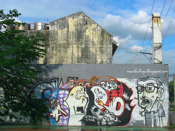
Finally, i chose this photo labeled: "Graffiti"
What the artist is trying to portray on this piece is still an enigma, the art itself doesn't show anything that signifies Manila, but i like this photo bec. it's different, it's quirky in a way, colorful, chaotic in some way and very subjective.
But as i'm re-posting it again, i notice something i haven't before, there are actually 3 figures on this piece.
the first one, you can obviously see it on the far right side (b&W) wearing glasses.
Now, see the color red on the right and the purple color on the left?
slowly, tilt your head towards both sides and you'll see the other two figures. ^-^

see it?!
Click here to view thumbnails for all participants
Friday, January 15, 2010
Best Photo of the Year
mini~notes
art,
graffiti,
intramuros,
street
Subscribe to:
Post Comments (Atom)
A very entertaining piece of graffiti.
ReplyDeleteCheers.
Melbourne Daily Photo
Wow, this is kinda neat...not the usual graffiti that some would usually do. Yeah, I did see the hidden figures, cool!
ReplyDeletemost graffitis give me a headache, although some like this are really works of art, I'd say. i'm sure the artist has a deeper meaning to this. but boy what a talent.
ReplyDeleteThat's some really funky, fun graffiti!
ReplyDeleteI remember this and I still think all our dirty blank walls should be painted such. ;)
ReplyDelete"Colorful and chaotic" — I think you described MM perfectly!
Oh, and J, the two figures lying down are a girl and a boy holding flowers toward each other. :)
ReplyDeleteAmazing griffiti!
ReplyDeleteActually this is very enigmatic graffiti, very surreal. But I also like the fonodo. That building so old that contrasts with an idyllic heaven.
ReplyDeleteCheers
I'm really fond of graffiti - on the right places! (I now even have some urban art in my flat, made by some Parisian graffiti artists!)
ReplyDeleteI think that the wall in the background might be an adequate place for some more!
It's a beautiful shot, I like it. It's colorful and well composed with the buildings in the background and the electricity poll which balance the photo. The graffiti looks very inventive, I like that one too.
ReplyDelete